

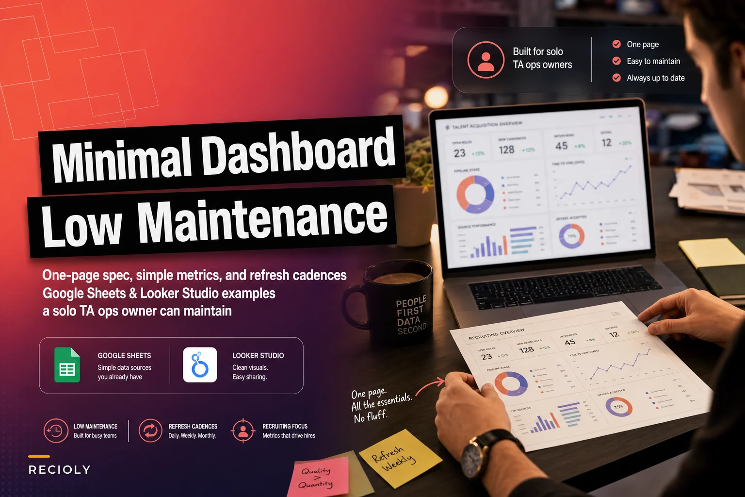

Most small recruiting teams need data visibility but can't justify enterprise BI tools. After building dozens of operational dashboards for lean TA teams, the ones that survive past month three share one trait: they're ruthlessly minimal.
The typical story goes like this. Your recruiting team finally gets budget approval for basic analytics. Someone builds an elaborate 12-tab dashboard pulling from five different systems. Two months later, half the metrics are broken, the other half show stale data, and everyone's back to asking for manual reports.
The problem isn't motivation or technical skill. Most small-team recruitment dashboards are designed for companies with dedicated analytics resources. When you're the sole TA ops person juggling req management, process documentation, vendor relationships, and now data maintenance, you need something fundamentally different.
Why traditional recruitment dashboards fail for small teams
Traditional recruitment dashboards assume three things that rarely exist in small teams: stable data sources, consistent refresh processes, and someone whose primary job is dashboard maintenance.
In reality, your ATS export format changes every quarter when the vendor pushes updates. Your hiring managers keep their interview feedback in personal spreadsheets. Your sourcing data lives across LinkedIn Recruiter, three job boards, and whatever new tool marketing just started using for employee referrals.
The maintenance burden compounds quickly. That fancy pipeline conversion funnel needs daily refreshes to stay relevant. Time-to-fill calculations break whenever someone forgets to update candidate stages. Diversity metrics require manual demographic coding because your ATS doesn't capture that data properly.
What starts as a 30-minute weekly update gradually expands. First you're fixing broken formulas. Then reconciling mismatched data. Before long, you're spending half your Friday manually updating a dashboard that executives glance at for thirty seconds during the Monday standup.
The one-page constraint that forces clarity
The most sustainable small-team recruitment dashboard fits on a single page or screen. Not because of technical limitations, but because constraint drives focus.
Never lose track of top talent again.
Recioly helps you manage every stage of recruiting efficiently, from application to offer.
- Centralized candidate tracking
- Automated interview scheduling
- Collaborative hiring workflows
No credit card required
When everything must fit on one page, you can't track vanity metrics. You eliminate the "nice to have" visualizations that sound strategic but don't drive decisions. You're forced to identify the four to six numbers that actually matter for your recruiting operations.
Here's what typically makes the cut for a sustainable one-page dashboard:
Active pipeline health (3 metrics max):
-
Open reqs by days aging
-
Candidates in active stages
-
This week's interview load
Velocity indicators (2 metrics):
-
Average days per stage
-
Offers extended vs accepted this month
Capacity signal (1 metric):
-
Recruiter workload distribution or req-to-recruiter ratio
Six numbers. That's it. They tell you whether your recruiting engine is healthy, where bottlenecks are forming, and whether you need to rebalance workload. Everything else becomes a quarterly deep-dive or a one-off analysis when someone actually needs it.
Low-maintenance data sources that won't break
The sustainability of your dashboard depends entirely on choosing data sources that don't require constant babysitting. Certain sources consistently prove more reliable than others.
Google Sheets as source of truth
Counterintuitively, a well-structured Google Sheet often outlasts fancy ATS exports. Create a simple candidate tracker with these columns:
-
Candidate name
-
Req ID
-
Current stage
-
Stage updated date
-
Assigned recruiter
-
Source
Have recruiters update this during their daily candidate review. Yes, it's manual entry. But it's also completely within your control, doesn't break when systems update, and can be modified instantly when processes change.
Add a 'Last updated' column to your candidate tracker so stakeholders can see data freshness.
ATS exports (selective use)
If you must use ATS data, stick to the most stable fields:
-
Requisition open date
-
Application received date
-
Current status
Avoid calculated fields, custom properties, or anything that depends on consistent user behavior. The moment you start tracking "days since last recruiter action," you've created a maintenance nightmare.
Calendar data for interview load
Pull interview counts directly from shared calendars rather than relying on ATS scheduling modules. A simple Google Calendar API connection or even manual weekly counts prove more reliable than trying to reconcile interview status fields that hiring managers never update correctly.
Refresh cadences that match reality
The biggest maintenance trap is committing to refresh frequencies you can't sustain. Daily updates sound great until you're out sick for three days and return to find executives questioning why the dashboard shows stale data.
Weekly updates (Monday morning):
-
Pipeline stages
-
Interview counts
-
Req aging
Monthly updates (first business day):
-
Offer acceptance rate
-
Time-to-fill averages
-
Source effectiveness
Quarterly updates (planning sessions):
-
Recruiter capacity analysis
-
Conversion funnel deep-dive
-
Competitive benchmarking
Build your dashboard assuming these cadences from day one. Use clear date stamps showing when each metric was last updated. Set expectations upfront that real-time data isn't realistic without dedicated resources.
Google Sheets dashboard that takes 30 minutes weekly
Here's a complete dashboard structure you can build in Google Sheets this afternoon and maintain in 30 minutes per week.
Sheet 1: Raw Data Input
Create a simple table where you paste or manually enter weekly pipeline data:
| Week Of | Open Reqs | Active Candidates | Screens Scheduled | Interviews Scheduled | Offers Extended |
|---|---|---|---|---|---|
| Oct 7 | 12 | 47 | 8 | 15 | 2 |
| Oct 14 | 14 | 52 | 11 | 18 | 3 |
Sheet 2: Current Week Dashboard
Use formulas to pull the most recent week's data and calculate key ratios: Open Requisitions: =INDEX(Sheet1!B:B,COUNTA(Sheet1!B:B)) Pipeline Coverage: =Active Candidates/Open Reqs Interview Load: =Screens + Interviews this week Offer Rate: =Offers Extended/Interviews (4-week average)
Sheet 3: Trend Visualizations
Create three simple charts:
-
Line graph
Open reqs over past 8 weeks
-
Bar chart
Weekly interview volume
-
Stacked bar
Pipeline distribution by stage
Keep formatting minimal. No fancy colors, no 3D effects, no unnecessary gridlines. Clean visualizations update automatically as you add weekly data.
Looker Studio setup for the slightly more ambitious
If you have slightly more time and want automated data pulls, Looker Studio (formerly Google Data Studio) offers a sustainable middle ground between spreadsheets and enterprise BI.
The key is using Looker Studio as a visualization layer only, not for complex data transformation. Keep your data simple and let Looker handle the display.
Basic Looker Studio architecture:
-
Data source
Google Sheet with your weekly metrics
-
Connection
Direct Google Sheets connector (no third-party tools)
-
Refresh
Automatic every 12 hours
-
Sharing
View-only link to stakeholders
Essential Looker Studio components:
-
Scorecard
Current open reqs (big number, top left)
-
Scorecard
This week's interviews (big number, top right)
-
Time series
Pipeline volume over time (center)
-
Table
Reqs by age bucket (bottom left)
-
Pie chart
Candidate sources this month (bottom right)
Avoid the temptation to add filters, date range selectors, or drill-down capabilities. Every interactive element multiplies maintenance complexity.
The maintenance routine that prevents dashboard death
Even the simplest dashboard dies without a consistent maintenance routine. Here's the 30-minute weekly process that keeps things alive:
Minutes 1-5: Data collection
-
Export ATS pipeline report
-
Count calendar interviews
-
Note offers extended/accepted
Minutes 6-15: Data entry
-
Add new row to tracking sheet
-
Update stage movements
-
Flag any data anomalies
Minutes 16-20: Validation
-
Check formulas still calculate correctly
-
Verify charts updated with new data
-
Spot any obvious errors
Minutes 21-25: Screenshot and share
-
Take screenshot of dashboard
-
Post in Slack recruiting channel
-
Tag anyone who needs specific callouts
Minutes 26-30: Note actions needed
-
Document any broken data sources
-
List metrics that need investigation
-
Schedule any one-off analyses requested
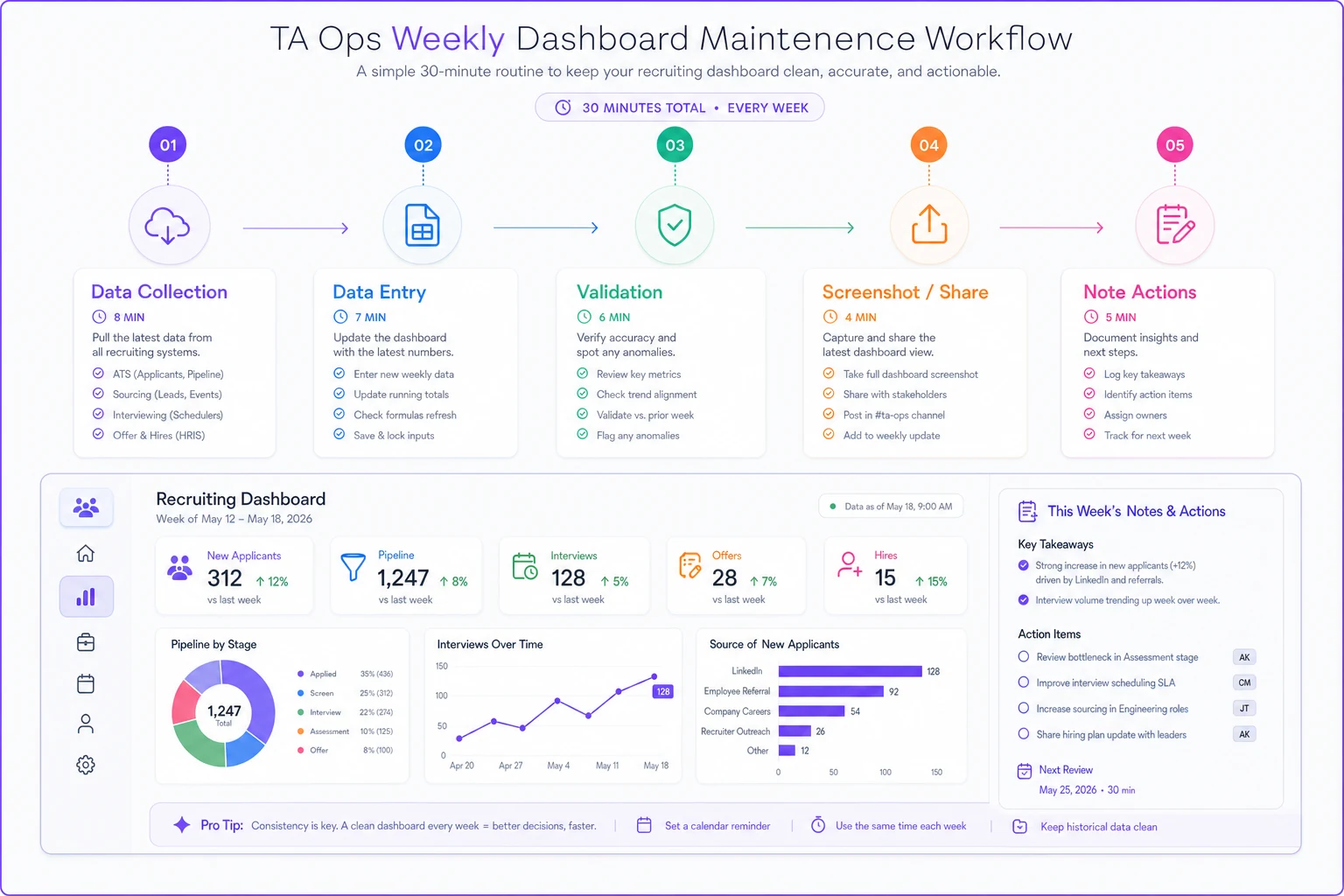
A compact flowchart like this makes it easy to share the routine with teammates and stakeholders.
Treat this like a recurring meeting, not an ad-hoc task. Block the time. Set the calendar reminder. Do it at the same time each week. The consistency matters more than the process itself.
When to add complexity (and when not to)
As your recruiting operations mature, you'll face pressure to expand the dashboard. Sometimes this makes sense.
Add complexity when:
-
You hire dedicated TA analytics support
-
Your team exceeds 5 recruiters
-
Leadership commits to data-driven decisions
-
You have automated data pipelines
Resist complexity when:
-
Someone wants their pet metric tracked
-
You're asked for real-time updates
-
The request requires manual data reconciliation
-
It breaks the one-page constraint
The moment your dashboard requires multiple pages or tabs, you've crossed into territory that needs dedicated maintenance. Either secure those resources or push back on the expansion.
Common pitfalls that kill small-team dashboards
These patterns consistently predict dashboard death:
The "executive request" trap: Your CEO sees a competitor's fancy recruiting dashboard at a conference and wants the same thing. You build it, they look once, then never again. Meanwhile, you're stuck maintaining complexity that adds no value.
The "perfect data" pursuit: Spending hours reconciling every data discrepancy instead of accepting that 85% accuracy is sufficient for directional decisions. Perfect data requires exponentially more effort than good-enough data.
The "automation at all costs" mindset: Building fragile integrations between systems to avoid 10 minutes of manual entry. When the integration breaks — and it will — you spend hours debugging instead of minutes doing manual updates.
The "metric creep" phenomenon: Starting with 6 metrics, adding "just one more" each month, until you're tracking 23 different KPIs that no one actually uses for decisions.
Making dashboard maintenance sustainable with automation
Full automation often creates more problems than it solves for small teams. But selective automation of specific tasks can meaningfully reduce the burden.
Focus automation on data collection, not transformation or visualization. A simple script that exports ATS data to Google Sheets saves time. A complex workflow that tries to clean, transform, and visualize that data automatically will break constantly.
The sweet spot for small-team automation:
-
Automated email reports from your ATS to a dedicated inbox
-
Google Apps Script that copies data from email attachments to sheets
-
Calendar integration that counts interview events
-
Slack bot that reminds you to update the dashboard
These automations handle tedious tasks while keeping you in control of data quality and dashboard logic.
AI-powered operational platforms can help here without requiring technical expertise. Instead of building brittle integrations, these tools can automatically pull data from multiple sources, standardize formats, and flag anomalies for human review. The key is choosing tools that enhance your workflow rather than ones that try to replace your judgment entirely.
Real success story: 90-day dashboard transformation
A 50-person startup I worked with struggled with their recruiting dashboard for months. They had a complex Tableau setup pulling from their ATS, HRIS, and three spreadsheets. The TA ops manager spent six to eight hours weekly just keeping it running.
We stripped it down to a single Google Sheet with five metrics:
-
Open roles by department
-
Candidates in pipeline
-
This week's interviews
-
Last week's offers
-
Average time to fill (30-day rolling)
The entire update process now takes about 25 minutes every Monday. More importantly, the dashboard has been consistently updated for seven months straight — something that never happened with the complex version.
The executives actually reference the simplified version more often because they trust the data is current. The TA ops manager redirected those saved hours toward process improvement and recruiter training, which created far more value than perfect dashboard maintenance ever could.
The uncomfortable truth about recruitment metrics
Most dashboard guides won't tell you this: for small recruiting teams, the dashboard itself matters less than the discipline of regular measurement.
The act of gathering data weekly, even manually, forces you to see patterns. You notice when pipeline coverage drops. You catch when certain reqs age past reasonable limits. You spot when one recruiter is overwhelmed while another has capacity.
Those observations drive better decisions than any fancy visualization could. The dashboard is just a forcing function to pay attention to the right signals.
Your small-team recruitment dashboard doesn't need to be sophisticated. It needs to exist, be maintainable, and get updated consistently. Start with the one-page constraint, choose low-maintenance data sources, commit to realistic refresh cadences, and resist complexity until you have resources to support it.
The goal isn't to build the perfect recruiting dashboard. It's to build one that survives long enough to actually improve your recruiting operations. In small teams, that means choosing sustainability over sophistication every time.
Ready to elevate your hiring process?
Join 1,500+ recruiting teams using Recioly to save time, improve collaboration, and hire smarter.